
Medical · 2026
Cancer Prevention Centre
Technical sheet
measured data- Location
- Piatra-Neamț
- Status
- Completed
- Client
- Medisprof
The work
description · images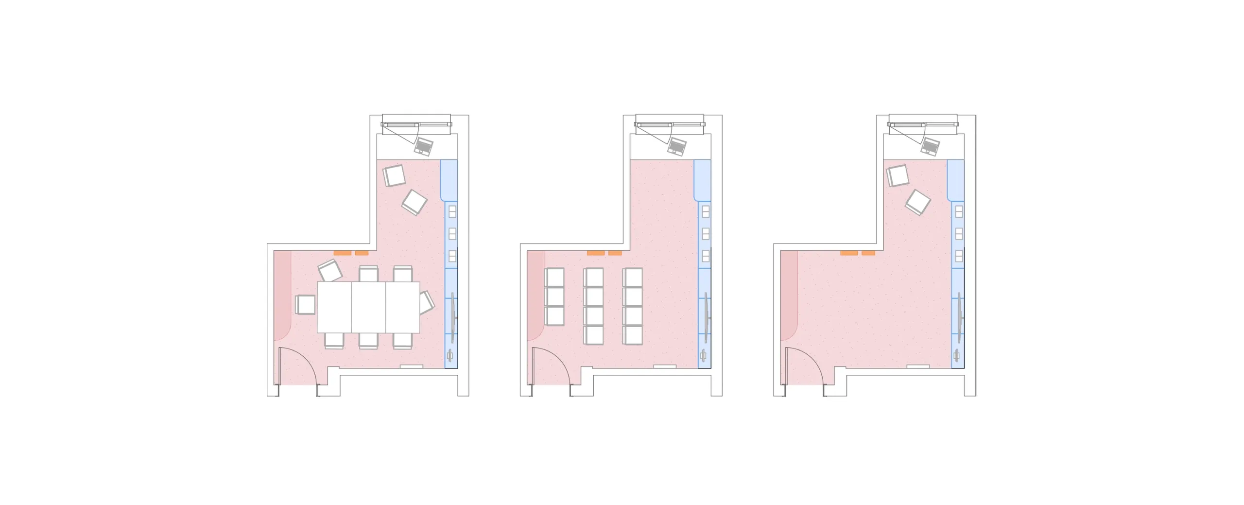

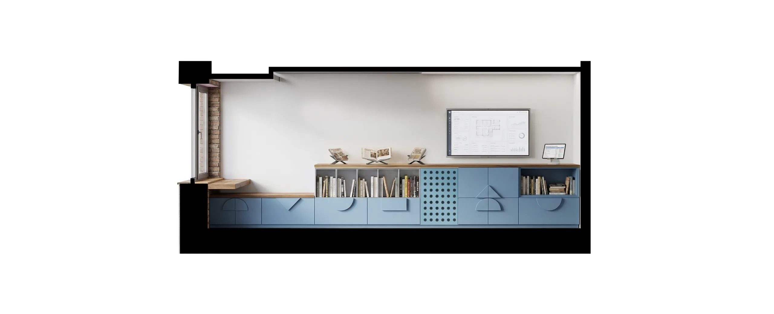
Through their language and atmosphere, prevention centres seek to distance themselves from typical medical functions. The design sets out to create a welcoming atmosphere based on familiar spatial typologies: a living room, a bookshop or a co-working space. At the same time, the aim is to keep the fit-out of the prevention centre connected to the building it belongs to; so as not to alienate the centre from the rest of the complex, the design relies on harmonising the colour palette, details and geometric motifs between the macro space of the clinic and the micro space of the room. This approach is essential for two reasons: the target audience covers a wide range of ages (children, teenagers, adults), and oncology is a sensitive subject that is difficult to address. By removing the elements that directly recall typical medical functions, the design shapes an environment that does not trigger a state of alarm, makes it easier to take in new information and encourages active participation in the process of prevention or recovery.
Flexibility and familiarity
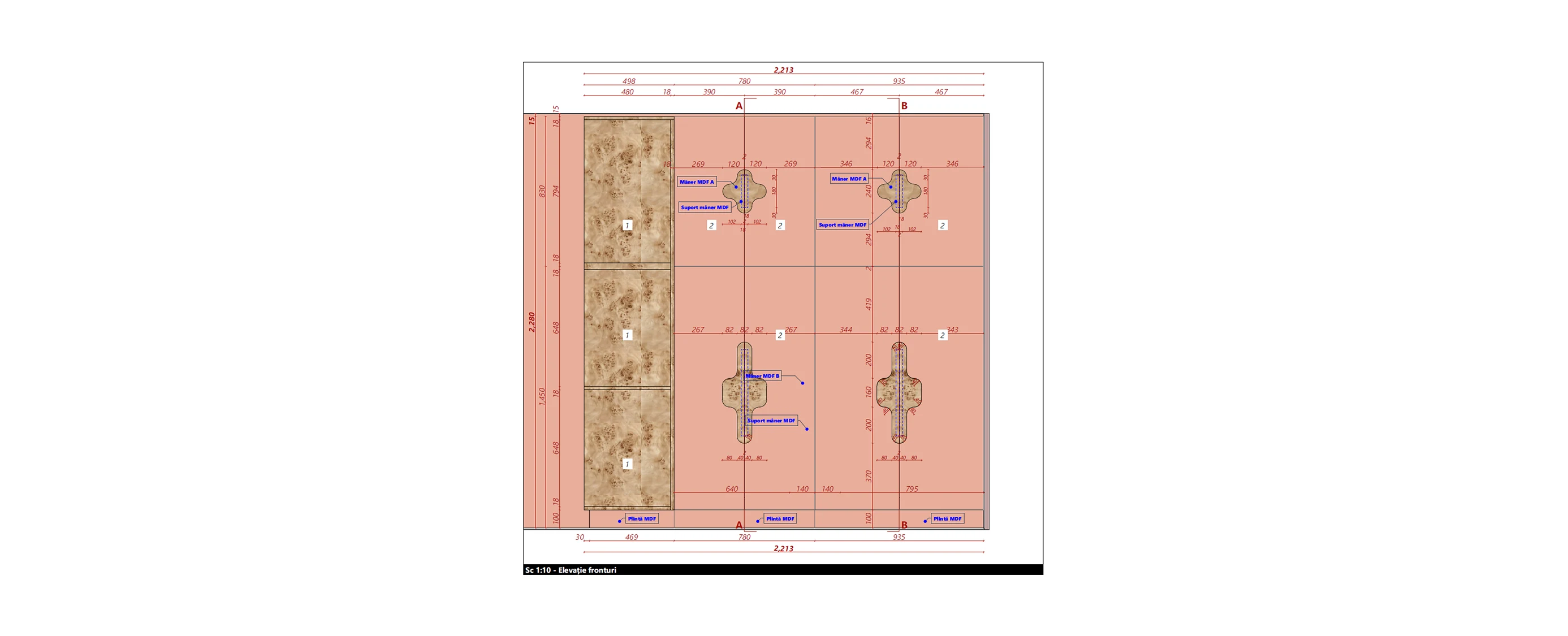
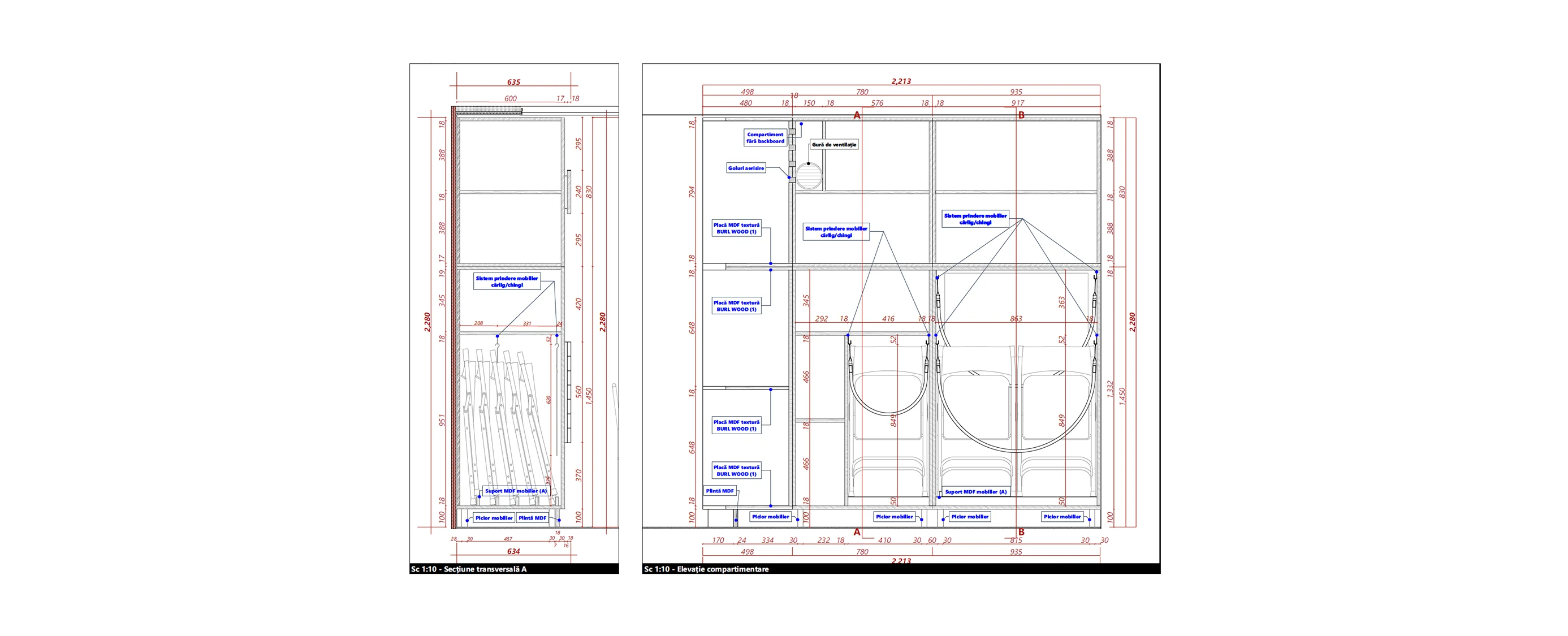
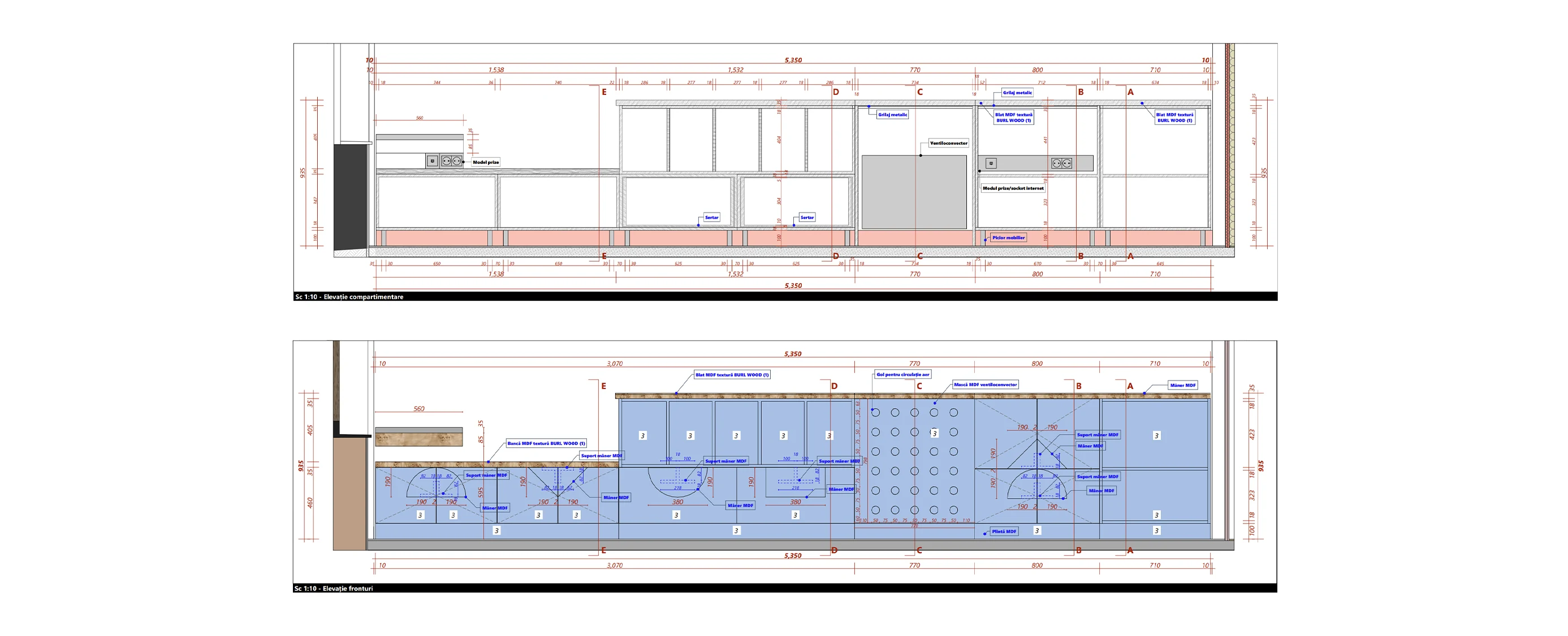
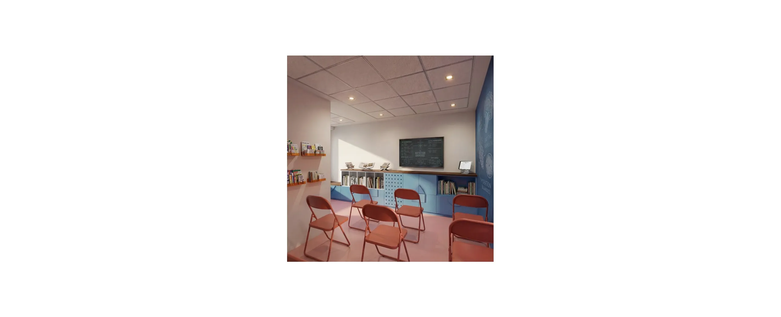
Flexibility means the capacity of the room to accommodate activities with varying flows of people, from cooking and art workshops to one-to-one counselling. The proposal therefore centres on a set of three tables and eight folding chairs that can be stored within the furniture pieces, on durable, easy-to-clean materials and, not least, on pieces that are coherent with the rest of the suite of objects. Another important aspect is the storage and separation of the various materials used in the centre, for example tableware and utensils for running nutrition workshops, paints and brushes, coloured pencils, clay modelling material etc. for art therapy, or posters, leaflets and printed presentations organised for presentations on the move.
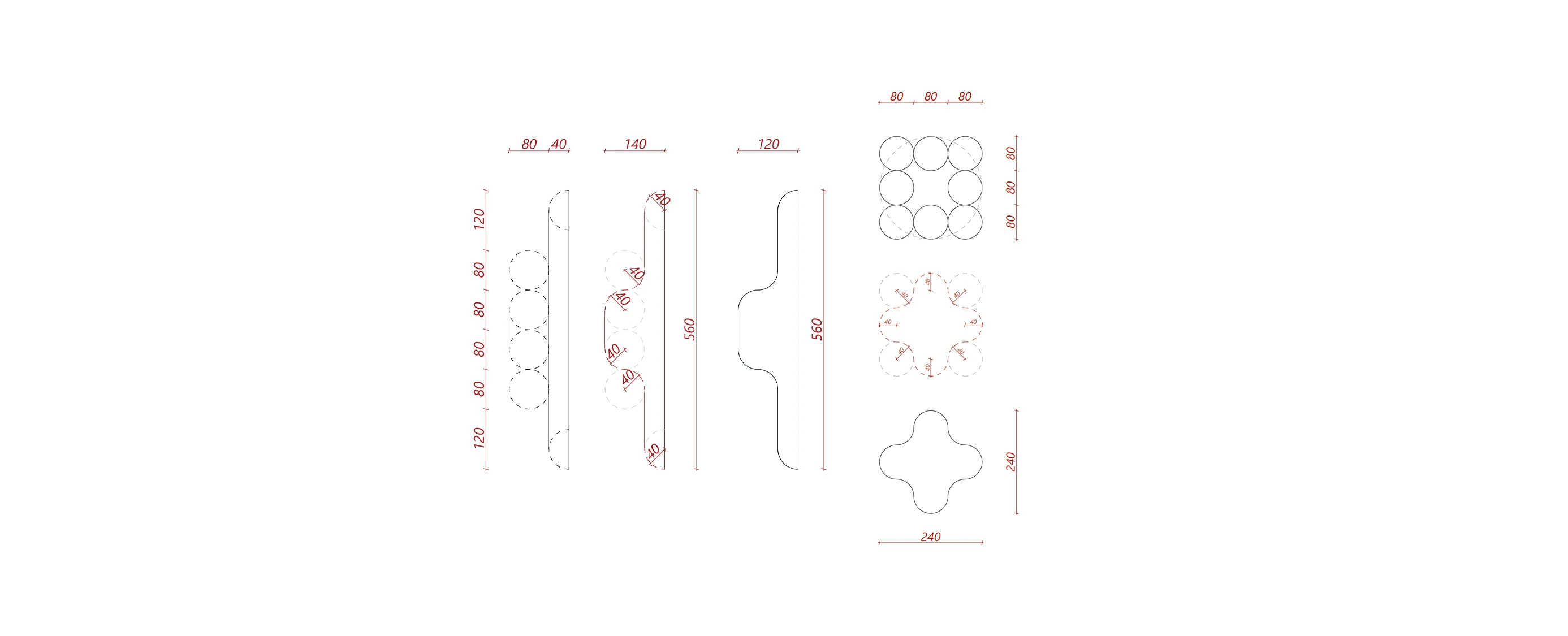
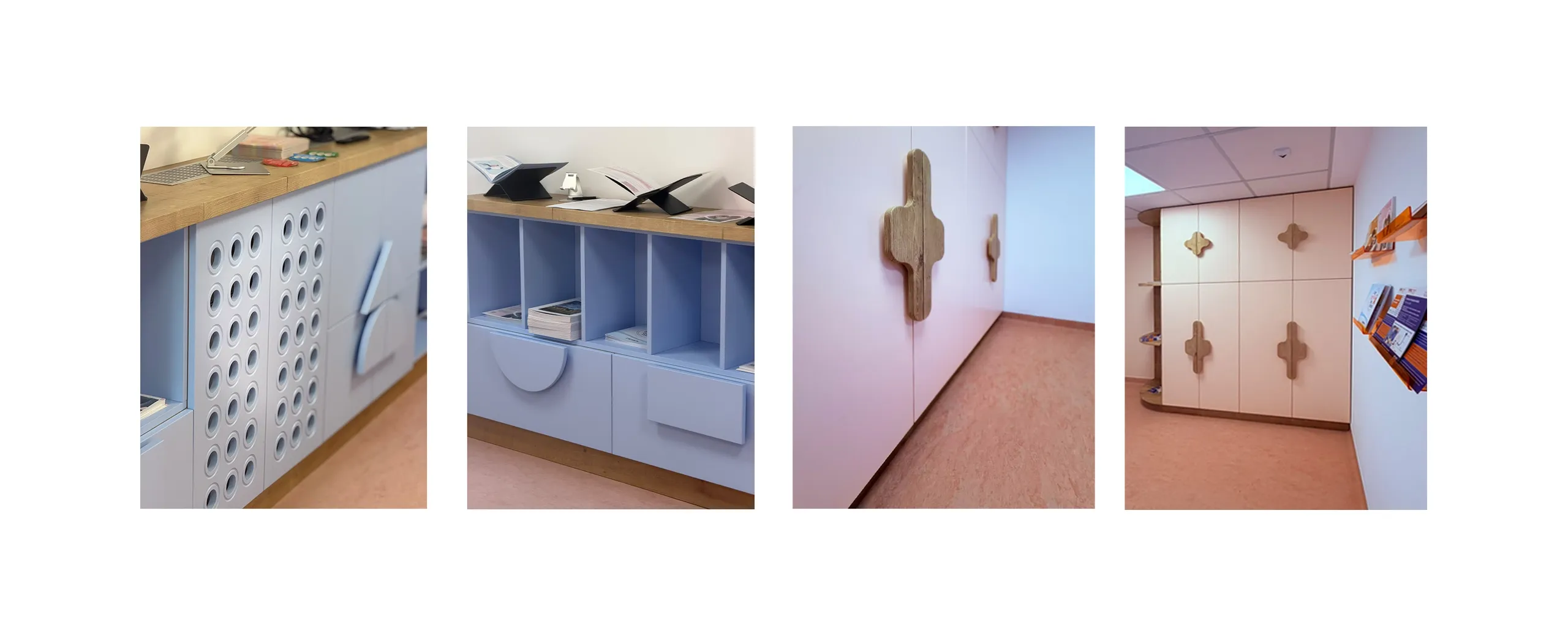
Familiarity is the quality of the fit-out that draws in a group of people, or perhaps even a small community, and persuades them to return for future sessions and activities. Cancer prevention is a difficult subject to discuss in detail, so the setting in which it is addressed must inspire a sense of safety and a certain detachment from the medical spaces in which oncological conditions are no longer merely a supposition. The proposal therefore relies on a playful, almost naive language, but one that does not alienate the different age groups who cross its threshold. The solution draws on movements such as mid-century modern and postmodernism, characterised by warm pastel colours, natural materials and a gentle return to decorative elements, all of which aim to instil personality and to create a space that is easy to take in and to make one’s own.
Credits
honest attribution- Implementation
- PROD ALCAR SRL
Services demonstrated
on this project-
Furniture design
Furniture design, from concept to execution details.
See the service